Travel Korea - Korea Travel Platform for foreigners
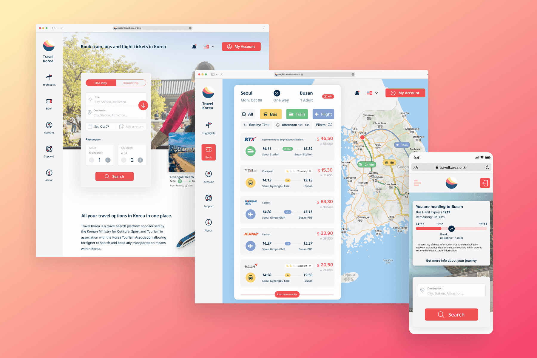
The Korean Ministry of Tourism and the Korean Tourism Association have partnered to launch a campaign that aims to enhance transportation and travel infrastructure accessibility for English speakers in Korea, including tourists and residents. As part of this initiative, I have designed a new web platform that enables non-Korean speakers to easily search and book various modes of transportation for traveling within Korea.

Travel Korea
Travel platform for international travelers in South Korea
Roles
UX Researcher
UX/UI Designer
Deliverables
Brand Logo
Responsive Website
Research
In order to understand more about the gap between local offers and foreigners' expectations, I started by analyzing how current services were addressed to English speakers.

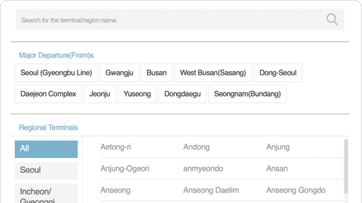
Clunky forms from 2002
Simply translated forms without effort to adapt to the targeted audience can easily lead to intimidating and frustration for most foreigners not familiar with Korean design patterns
Lack of contextual information
These services can also be especially hard to use if you don't already have some knowledge about Korean geography.
I have interviewed multiple foreigners in Korea ; from the long-term resident, fluent in Korean ; to the student freshly arrived in Seoul with no prior Korean-language abilities.
Residents in Korea(Long Term Visa)
Local websites' ease-of-use for foreigners living in Korea for a while will highly depend on their ability to handle the language.

Travelers(Short Term Visa)
the lack of accurate sources of information is another important one and often require travelers to double-check any information gathered online or while reading a travel guide.

Understand user needs

Ideation
Now that I have a clear vision on what my product should offer to users, it was time to dig more in details on how to translate this into workable patterns.
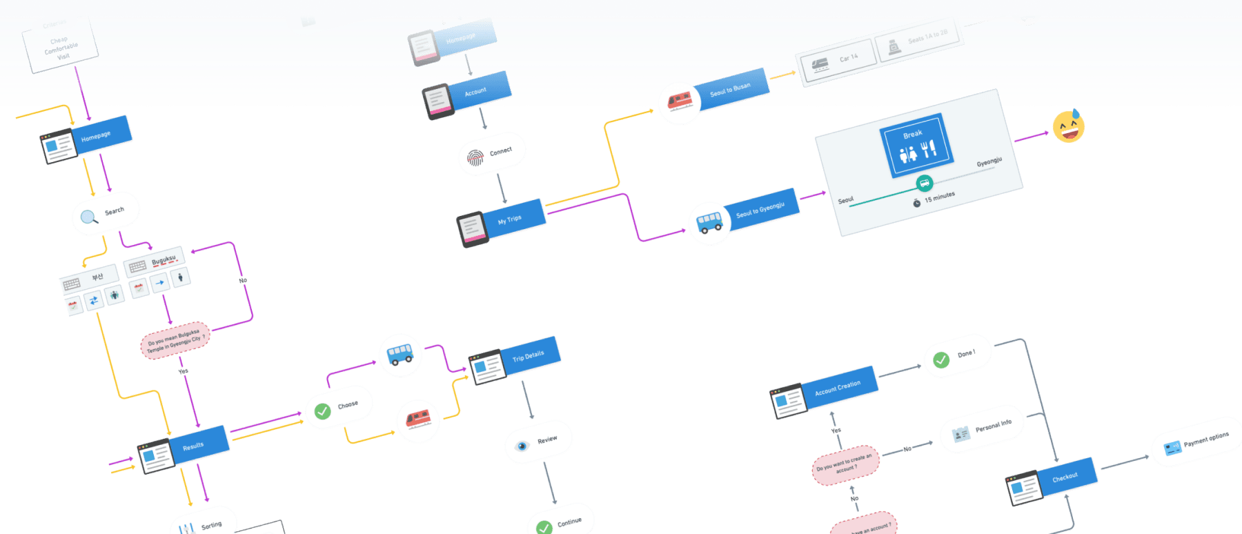
Users flows
Sitemap

Branding
As this project is focused on creating a product from scratch, it's essential to spend some time on the identity of the product. To this end, I have decided to create a simple logo to strengthen users' feeling of using a professional product that they can trust. In the same order, I have selected some colours that, in addition slight variation of Korean's colours, will allow to support information architecture within the product.
Logo

Understand user needs

Branding
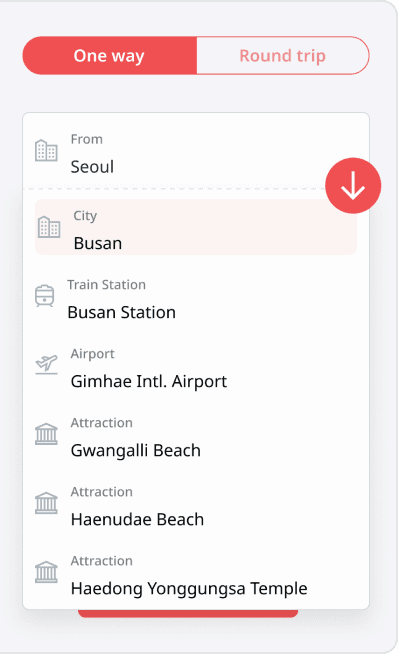
An UI focusing on delivering the best search and book process

UI Design for Mobile
An UI focusing on the user experience before and during the trip

Designed in Figma, Built with Framer

